2016 has been a great year for web design. We have seen web designers pushing the boundaries of grid systems to make their web design stand out (I think we all agree the use of a grid system is great but websites all started to look the same!). The advancements in CSS3 animations and Canvas have made interactions so much more eye catching.
Here’s what we think is going to be the trend for 2017.
Tweet This1. More unusual layouts
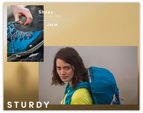
When used correctly and within the right industry, unusual layouts are a great way to add a bit of creativity and originality to a website – using text and images to overlap makes it interesting. I can see designers taking this to the next level in 2017.
2. Logos & branding
![]()
The Lego logo in 1934
From the 1930’s until recently there have been very particular styles in how a brand has been constructed, for example, the 1930’s saw the use of simple serif logos
The 1950’s moved to sans serif, 2000’s were 3D Design, today, everyone uses something different; some using negative space, some sans, some serif. This will only expand as we go through 2017 as designers wanting their work and client brands to stand out will play on these differences.
3. Animations
Animations in web design are becoming more of a norm than a speciality, 2017 will see a year where this is not only fully embraced but the animation will become better supported by browsers and more advanced – I’m not saying they should be used to excess though, but a nice animation for a promo page or a creative website is a good way to stand out from your competition.
4. Stock images
This is one I will not be sad to see go! There is a huge decline in the use of stock imagery, personally I always suggest to take your own photography – where’s the sense in paying £30k+ for a beautiful custom website and then sticking photography on that anyone can get?
Using your own imagery means you can get that perfect angle, lighting and it’s one of a kind – just how it should be!
5. Bright colours & gradients
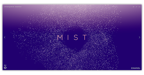
Example: Intangible Matter
I LOVE a Monochrome website, but I also love the other side, big and bright, last year we had seen a few web sites popping up with bold, bright colours and gradients. I presume we will be seeing a lot more of this during the coming year.
That’s only 5, there will be plenty more I’m sure! If you’re planning on redesigning next year and you like a trend, great! But before you jump in wholeheartedly demanding it firstly think, is it right for my company/industry and secondly remember that trends fade, your website could end up looking out of date quicker than you want. A trend is great if used in the right way, adding hints of it means it will stand the test of time – cover your website in it and it could have a much shorter life.
Having said that, some trends will stay for years to come, a designer should know which these are and advise you on it.